 Skip to main content

W&M’s homepage gets 'refreshed'
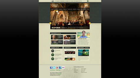
William & Mary’s homepage is sporting a fresh new look today, thanks to the efforts of William & Mary’s Creative Services team.
The new design allows more content to be available on the homepage and makes the page easier to use on mobile and tablet devices. The page is also less boxy and more “visually breathable” now, according to Justin Schoonmaker, acting associate director of Creative Services.
Although the entire William & Mary website is only four years old, “in the Web world, four years is a long time,” Schoonmaker said.
Unlike a redesign project, which would include possibly changing the color palette, text choices and layout for the entire website, the Creative Services team sought to “refresh” the homepage “to be in keeping with current design trends,” Schoonmaker said.
“It was intended to be something that still goes well with all the other page types that we have,” he said, adding that all of the other pages on the site would remain the same while incorporating the new homepage’s header and footer.
New Features
The new design includes several new features, including the ability to play videos and access to more content.
“We wanted to find a way to have more content on the homepage without making it feel like there was more content there from a visual perspective,” said Schoonmaker.
As a result, the new design includes a scroll-through option for things like the large featured photo and the news headlines. Before, users had to refresh the page to see new featured photos and could only see three news headlines without going to the news page. Now, users can scroll through up to five photos and can access up to 11 news stories without ever leaving the homepage.
“Without adding more visually, we’re in effect almost tripling the amount of content on the homepage without doing anything visually that is crowding things out, which is really cool,” said Schoonmaker.
The new design is also adaptable for tablet and mobile devices. When the current website launched four years ago, the iPad had not come out yet, and tablet use was not widespread.
“Because so many people are using iPads now, we wanted to have a homepage that is more conducive to tactile use as opposed to clicking with a mouse,” he said. “So what somebody might notice on the new homepage is that a lot of the links are more ‘buttony.’ There are circles on the page that are more in line with putting your finger on the screen. But they’re not so big and out there that it feels weird on a desktop either or using a mouse.”
For instance, to previously access the events listed on the homepage, users had to click on hyperlinked text. Now, next to the event’s title, a circle with the event’s date appears. The “button” can be clicked by a mouse or easily touched on a tablet or mobile device.
In addition, the new design utilizes “responsive design.”
“Based on the size of the screen that you are using, the page will adjust to present the content for that screen in a way that’s unique and a way that fits that screen’s resolution without shrinking things,” said Schoonmaker.
For instance, when the homepage is accessed on an iPad in portrait view, it will automatically shift things around so that elements such as the news and blog blocks will appear in a two-column layout. If the page is viewed on a mobile device in portrait view, the page will shift to present all of its content in a one-column format.
The “refreshed” homepage is now also more accessible for visually impaired users.
“There’s a big push -- and rightfully so – in web design and web programming to have accessibility on the forefront of people’s priorities,” said Schoonmaker.
Creative Process
The “refresh” project began last fall when, under the leadership of project manager Tina Coleman, four members of the Creative Services team drafted up possible designs for the page. Following a creative model said to be used by Apple, the team crafted the designs without any constraints in mind.
“We started off saying, we can design anything,” said Schoonmaker. “This may be a refresh, but it may be worth our time to design something completely new just to see what’s possible and what might inspire a change in the refresh.”
Schoonmaker, who oversaw the design process, later met with Coleman, now the interim director of Creative Services, to discuss the designs and talk about constraints. With those in mind, the team then sought the feedback of other design professionals on campus.
“This is a big deal. This is most viewed webpage in our entire web presence,” said Schoonmaker. “It gets viewed millions of times a year … so we wanted, first of all, to get more opinions, and second of all, we wanted to foster peer review relationships for our work across campus.”
Fostering that kind of cross-campus collaboration is in keeping with the academic spirit of William & Mary, said Schoonmaker.
“Even though we’re not doing the academic side of things, we’re still doing work that is supposed to further the cause of the institution, so we’re kind of bringing in that aspect of academic life to this,” he said. “Instead of a peer-reviewed journal, it’s peer-reviewed design.”
In addition to seeking input from colleagues across campus, the team also researched 26 peer institutions.
Finally, with that research in mind and the help of colleagues at the Alumni Association and in University Development, the team settled on a design, and Mark Windley, CMS (content management system) manager, began leading the technical implementation.
Setting a Trend
The project's "evolutionary design" concept could become part of a trend in higher education, where website designers "refresh" their pages instead of completing a full redesign, said Schoonmaker.
Evolutionary design is more user-friendly because it "doesn't insist that people get used to something new altogether," he said. For instance, users of the William & Mary homepage will find all the content that was available on the old page in roughly the same place.
The project's success will be thanks to the
multiple in-house designers that worked on it. That, too, could become a trend
in higher education, Schoonmaker said.
“It could contribute to schools having more people on staff instead of always farming out their work,” he said. “Schools are always looking for ways to save money. When we can insource instead of outsource for a project of this size, that’s a win for the school. I could see other people latching on to that idea.”