 Skip to main content

Collapsible Lists
Do you have a page with a lot of content divided up using Heading 2s or Heading 3s? Would you like to offer a consolidated view of your content when your visitors first land on your page? You may want to consider the collapsible list content feature.
This feature turns your Heading 2s and 3s into clickable text elements used to expand and collapse the content that follows.
The Expand All / Collapse All button that appears above lets visitors open or close every section on the page with a single click. The button's label will automatically adjust for context:
- It shows "Expand All" / "Collapse All" if your page only has one main list of collapsible sections.
- It shows "Expand Section" / "Collapse Section" if your page has multiple distinct lists.
- On mobile screens, it simplifies to "Expand" and "Collapse."
You can see a collapsible list on the university's Report Concerns or Violations website.
Accessibility Tip: While collapsible lists are built using tables and they are for layout purposes they are specially coded to be accessible. They are the one exception to the rule about not using tables for layout purposes. To avoid creating an accessibility barrier to your content, do not include a table of information within a table you're using to create a collapsible list.
How to Create a Collapsible List
- Create a one-column table with a row for each section of content to be collapsed — be sure to follow the steps for including a caption for screen readers. Do not resize your table by clicking and dragging the corner element. This can lead to an inconsistent layout across devices and browser sizes, notably as gaps between your collapsed content sections.
- In each cell, start with a Heading 2 to serve as the clickable area to open/close the content (or a Heading 3 if you are using Heading 2s to organize the page more broadly).
Tip: To organize content within collapsed sections using headings, use a Heading 2 for your open/close heading and Heading 3s within the collapsed content. - Below the heading, enter the content to be collapsed in the same table cell. Repeat for each section of content, placing each section in its own row of the table.
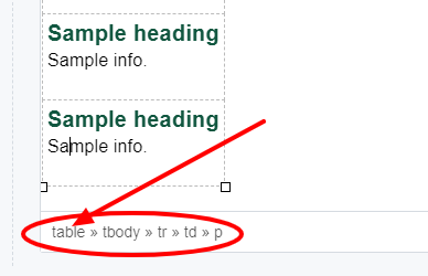
- Apply the collapsible format to the table: Select your table by placing your cursor anywhere within the table and clicking "table" in the element path breadcrumbs at the bottom of the editor. Then select collapsible from the Formats >> Custom sub-menu.
- Click Preview Draft to review your draft and test the expand/collapse feature.
- Click Submit >> Check Content & Submit. The Accessibility section of the Content Checker will identify that the table requires a caption. Select Fix and fill in a simple caption such as "Layout table." This caption will be specially handled in the code to help ensure the table is accessible to those using assistive technologies.
- Publish.
Tip: Content that is collapsed using this feature is "visible" to search engines. However, as with any page, to help potential visitors find it via search, it's best to ensure your most valuable keywords are included in the page elements prioritized by search engines: the page title and headings. Content located higher up on a page is also prioritized.