Close menu William & Mary

Color Palette

Color is one of the most immediate connection points with the William & Mary brand. Our palette reflects the depth, heritage and vitality of the university — from our signature greens and golds to the complementary tones that bring energy and balance. 

Correct usage helps maintain visual coherence, strengthen brand recognition and create a unified experience. Both the Primary and Spirit Palettes include supporting secondary greens, which provide flexibility and depth while reinforcing the brand’s identity. These greens are not meant to replace the lead colors, but to complement them in balanced, intentional ways. The Tertiary Palette adds sophistication and visual interest to the brand. 

Primary Color Palette

It is essential to consistently use the Primary Color Palette across all brand touchpoints. This palette forms the foundation of William & Mary’s identity and ensures visual consistency. The primary colors consist of W&M Green, W&M Gold, W&M Silver and White, supported by a secondary set of complementary greens that add flexibility and depth to the system.

Recommended usage: The Primary Color Palette should make up the majority of your design. As a guideline, approximately 70-80% of the color space in any composition should be drawn from the Primary Palette. This ensures that the brand remains strong and recognizable. Accent colors, textures or imagery should not overwhelm the dominant presence of these primary hues. 

Dark green background

W&M Green

Pantone 343C RGB: 0 78 56 CMYK: 89 19 72 60 Hex: #004E38 

Gold background

W&M Gold

Pantone 465  Metallic: PMS 872  RGB: 183 146 87  CMYK: 9 29 66 24  Hex: #B79257 ADA Web Hex: #866F45

Silver background

W&M Silver

Pantone 427  Metallic: Pantone 877  RGB: 216 220 219  CMYK: 7 3 5 8  Hex: #D8DCDB

White background

White

RGB: 255 255 255  CMYK: 0 0 0 0  Hex: #FFFFFF 

Secondary Greens

These secondary greens should be used to enhance layouts, provide tonal range and support visual balance, but not replace the core brand colors. Always prioritize the primary colors in communications, marketing materials and digital assets.

Dark green background

Dark Green

RGB: 17 87 64  CMYK: 100 44 71 80  Hex: #00231B 

Green background

Griffin Green

RGB: 40 70 62  CMYK: 63 27 50 67  Hex: #28463D

A mint teal green background

Patina

RGB: 118 161 144 CMYK: 57 23 47 1  Hex: #76A190

light green

Sage

RGB: 184 221 177  CMYK: 29 0 38 0  Hex: #B8DDB1

Bright green background

Moss

Pantone: 576 RGB: 120 157 74 CMYK: 54 5 94 24  Hex: #789D4A

Spirit Color Palette

The Spirit Color Palette, built around Spirit Gold, embodies energy and excitement. It is intended for special moments of celebration and pride, such as athletic competitions, Homecoming and other spirited events. In these cases, the Spirit Palette can substitute for the Primary Palette to create a bold and festive impression.

Recommended usage: When used in place of the Primary Palette, as a guideline, approximately 70–80% of the color space in any composition should be drawn from the Spirit Palette. 

Important restriction: Spirit Gold should never be paired with W&M Gold in the same composition, as the two colors are too close in hue and may cause visual confusion or diminish impact. Designers should choose one or the other depending on the application, not both together. 

Dark green background

W&M Green

Pantone 343C RGB: 0 78 56 CMYK: 89 19 72 60 Hex: #004E38

bright yellow

W&M Spirit Gold

Pantone 7409  RGB: 253 183 20 CMYK: 0 31 100 0  Hex: #FDB714

Silver background

W&M Silver

Pantone 427 Metallic: Pantone 877 RGB: 216 220 219 CMYK: 7 3 5 8 Hex: #D8DCDB

White background

White

RGB: 255 255 255 CMYK: 0 0 0 0 Hex: #FFFFFF

Spirit Color Palette Secondary Greens

Similar to the Primary Palette, the Spirit Palette includes a set of secondary greens designed for enhancement and balance. These greens provide grounding and continuity, ensuring that spirited applications still feel cohesive and unmistakably William & Mary.

Dark green background

Dark Green

RGB: 17 87 64  CMYK: 100 44 71 80  Hex: #00231B 

Green background

Griffin Green

RGB: 40 70 62  CMYK: 63 27 50 67  Hex: #28463D

Bright green background

Moss

Pantone 576 RGB: 120 157 74 CMYK: 54 5 94 24  Hex: #789D4A

Tertiary Color Palette

The Tertiary Color Palette adds sophistication and visual interest to the brand. These colors are designed to complement the Primary Palette and broaden the range of the system. They should be used sparingly and only when warranted, such as in design collaborations or when William & Mary is paired with other brands (e.g., the Batten School of Coastal & Marine Sciences or VIMS). Overuse of tertiary colors can dilute the brand identity, so employ them with care and intentionality.

Recommended Usage: Tertiary colors should be applied at a maximum of 10–15% of a given design. They work best in secondary graphic elements, supporting illustrations, or when aligning with a partner organization’s palette. Avoid using tertiary colors in logos or as primary background fields. 

Dark teal blue background

Midnight Blue

RGB: 13 61 73  CMYK: 93 63 53 43  Hex: #0D3E4A 

Teal blue background

Marine Blue

RGB: 36 123 141  CMYK: 68 9 16 39 Hex: #247B8C

light blue

Slate Blue

RGB: 116 153 193  CMYK: 57 32 9 0  Hex: #7399C1 

Purple

Royal Purple

RGB: 103 62 101  CMYK: 55 78 26 30  Hex: #673E65

Brick red background

Brick Red

RGB: 150 74 55  CMYK: 30 77 81 22  Hex: #964A37 

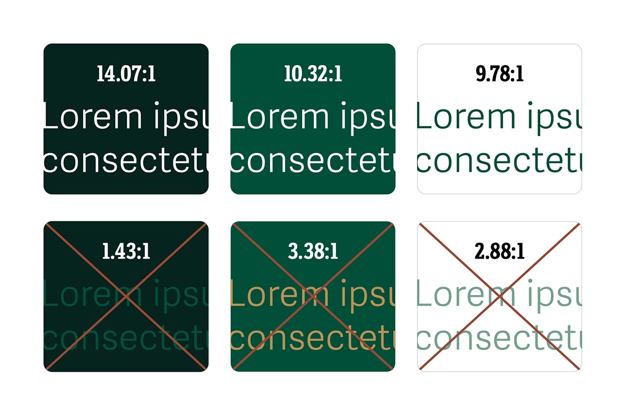
Six text blocks that either pass or fail accessibility text color contrast guidelines

Color Accessibility & Contrast

Color accessibility and contrast are critical in branding and marketing because they directly affect readability, comprehension and overall user experience. High contrast between text and background ensures that information is easily seen and understood across all devices and lighting conditions, reducing fatigue and confusion. Proper color contrast also preserves the integrity of a brand’s visual identity, ensuring consistent recognition and impact across media.

Beyond best practice, maintaining adequate contrast is a legal requirement under the Web Content Accessibility Guidelines (WCAG). W&M adheres to WCAG 2.1 Level AA standards for all websites which specify minimum contrast ratios of 4.5:1 for normal text and 3:1 for large text. Whether a particular color combination meets the necessary ratios can be determined using the WebAIM Contrast Checker.

Color Palette Usage Do's & Don'ts

Color Do's & Don'ts

Do

Don't

Have Questions About Applying the Brand?

The offices of University Marketing and University Communications maintain William & Mary’s visual identity and brand guidelines. Their staff of marketing and communications professionals are available to respond to questions and assist with requests.