Close menu William & Mary

Graphic Elements

Graphic elements add texture, movement and dimension to the William & Mary brand. Inspired by the campus environment and the institution’s enduring sense of place, these visuals provide creative flexibility while reinforcing our distinct aesthetic. They should always support — never compete with — core brand elements such as the logo, typography and color palette. Used thoughtfully, graphic elements help convey the depth, warmth and sophistication that define William & Mary.

William & Mary maintains various visuals that are used as graphic assets in university communications. Whereas a logo provides primary branding for communication, graphic assets are supplementary visuals. They are not intended to act as logos or to replace or be added to the university logo, but to help communicators complement the university logo with additional creative artwork and connect to visuals on campus.

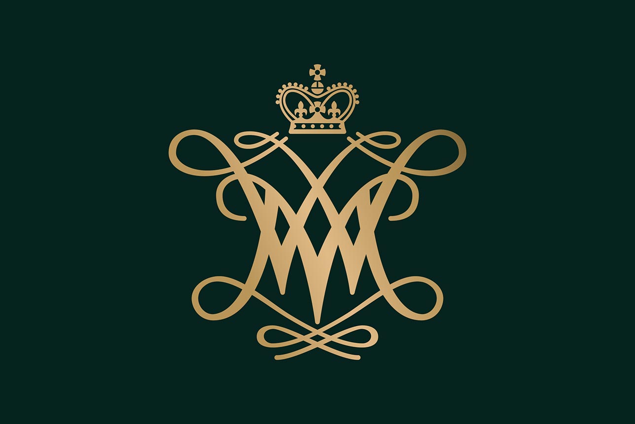
Elegant gold monogram of intertwined 'W' and "M" letters forming a cypher, crowned with a regal crown, on a dark green background

Cypher

The W&M cypher remains a central and cherished symbol of the university. It serves as a graphic element to bring a sense of connection and tradition to designs. The cypher may appear independently on materials such as apparel, merchandise, or other creative applications, as long as it is not combined directly with departmental or programmatic names. Used in this way, it continues to represent the strength and tradition of the William & Mary brand while allowing flexibility in design.

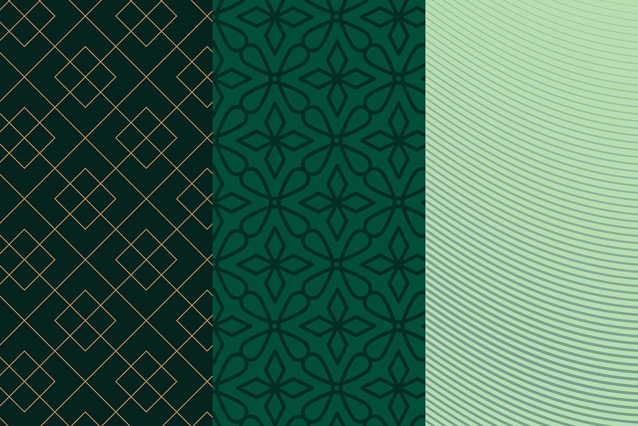
A three-panel design features geometric patterns: left has gold intersecting diamonds, center showcases dark green floral shapes, right has light green wavy lines

Background Patterns & Textures

Drawing inspiration from the university’s architecture and landscaping, many patterns and textures can be pulled into brand materials; offering a subtle nod to the tradition of the institution and campus. These patterns and textures bring a polished, modern aspect to design assets that helps the brand distinguish itself from competitors in a way that few schools can.

A green background with top right and bottom left lighter gradients

Gradients

With unlimited use cases in both print and digital applications, these gradients help propel the brand into the modern era by adding a depth, elegance, and a subtle level of sophistication to advertising and marketing materials.

A selection of pre-approved gradients is available for use, ensuring consistency across materials. Users are not limited to these however, and gradients may also be created using colors from a preapproved palette to maintain alignment with the brand’s visual identity.

A dark green background with gold outlined icons

Icon Library

Icons provide visual clarity and enhance navigation across William & Mary communications. The preferred resource for icons is Font Awesome, which provides a robust catalog of options, each with multiple weights and styles. The icon library can also be easily used across websites and apps through code, integrated and synced with programs like Figma, and all the icons can be downloaded as vector or flat art assets.

The W&M coat of arms, a shield with a sun at the top, blue sky, building skyline and green grass

Coat of Arms

William & Mary was the first American institution of higher learning with a royal coat of arms. It was issued on May 14, 1694 by the College of Arms in London. The buildings featured are not modeled on buildings at William & Mary as the coat of arms was received before construction of the Wren Building in Williamsburg was begun.

The coat of arms, while not used as the everyday logo to represent the university, is still used in certain ceremonial contexts. It can be seen as a hanging display at traditional ceremonies such as Charter Day and Commencement. It also appears on university diplomas, the university mace and on regalia.

Pattern & Texture Usage Do's & Don'ts

Pattern & Texture Do's & Don'ts

Do

  • Do use .eps files for print and .png files for web.
  • Do default to the darker patterns on W&M Green or Griffin Green, but all brand colors acceptable.
  • Do alter the transparency of the shapes and patterns to use them in a subtle way.
  • Do crop or zoom into the shapes and patterns proportionally when necessary.
  • Do consider accessibility when using as a layer on the web.

Don't

  • Don't edit the layout of the patterns.
  • Don't use the shapes to create custom logos.
  • Don't overlay the shapes and patterns on top of a clashing background.
  • Don't use patterns behind body copy.

Gradient Usage Do's & Don'ts

Gradient Do's & Don'ts

Do

  • Do use subtle gradients to add visual interest and refinement.
  • Do apply gradients to large backgrounds rather than relying on large flat fields of color.
  • Do use gradients to complement metallic gold and the Cypher so the visual palette feels cohesive.
  • Do use gradients in digital environments and interfaces to improve depth and polish.
  • Do maintain smooth and gradual transitions between colors so the gradient feels refined and
    intentional.

Don't

  • Don't use large gradients as backgrounds of print pieces that do not have noise to avoid banding.
  • Don't use bold, high-contrast or abrupt gradients that feel distracting.
  • Don't create gradients that visually compete with the Cypher if both appear together.
  • Don't rely on flat, single-tone large color blocks where a gradient is better suited to add dimension.
  • Don't treat gradients as decorative effects without purpose.
  • Don't use gradients that introduce colors outside the approved palette.

Have Questions About Applying the Brand?

The offices of University Marketing and University Communications maintain William & Mary’s visual identity and brand guidelines. Their staff of marketing and communications professionals are available to respond to questions and assist with requests.