Typography
Typography is an essential part of our brand. It communicates not just what we say, but how we say it — with clarity, authority and grace. Our approved typefaces work in harmony to balance tradition and modernity, mirroring the university’s blend of history and innovation. Consistent use of these fonts ensures every message looks and feels unmistakably William & Mary, whether in print, digital or presentation form.
- Always use our primary typeface, Adelle, when possible, for consistency across brand materials.
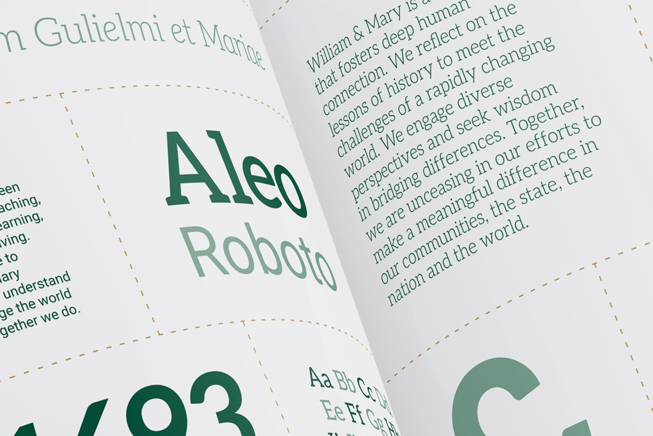
- When Adelle is not an option, use Aleo for headings and Roboto for body copy to best reflect the intended hierarchy and tone.
- When primary or alternate typefaces are not available, Arial and Georgia may be used.
- Do not mix in unapproved fonts or substitutes.
- Ensure font usage remains consistent across print, digital and presentation materials.