 Skip to main content

Email Link Standards
About This Page
Consistent, accessible link and button styling makes calls to action in an email identifiable for readers who need more than color alone to recognize clickable text, and easier to spot for every other reader too. Here you will find the color, weight and treatment rules for inline links, CTA buttons, navigation and footer links, examples of each in practice and a checklist for confirming an email meets WCAG contrast and touch-target standards before it sends. These standards apply to every styled (HTML-based) William & Mary email, whether sent through Marketing Cloud, Emma, Slate or through a one-off or other third-party platform send.
Quick Reference
| Where | Treatment | Weight | Color |
|---|---|---|---|
| Inline body link (light bg) | Underlined | Regular | Dark Gold (#846838) |
| Inline body link (Dark Green bg) | Underlined | Regular | Web Gold (#B08F5A) |
| CTA text link ("Read More") | Underlined + chevron | Bold | Dark Gold (#846838) |
| Primary CTA button | Solid fill, White text, ALL CAPS | Bold |
Dark Gold (#846838) or W&M Green (#004E38) |
| Article heading link | Heading style, no underline | Bold (heading) | W&M Green (#004E38) |
| Top nav links | No underline | Semibold, uppercase | W&M Green (#004E38) |
| Footer / utility links | Underlined | Regular | Dark Silver (#565858) |
| Bold text | Editorial empasis, never a link | Bold | Soft Black (#212220) or White (#FFFFFF) |
Rules
1. Every inline body link needs two signals — color is not enough
WCAG AA requires links be distinguishable from surrounding text by more than color alone. This is why underline is required in addition to gold.
2. Bold is for emphasis, gold + underline is for links
Reserve bold text for emphasis in body copy. Reserve gold + underline for “this is clickable.”
3. Bold weight is only added when prominence is the goal
CTAs get bold. Inline body links do not.
4. Headings that link stay styled as headings
Wherever possible, don't make headings clickable. When you must, never apply gold and underline to the heading itself. Style it in W&M Green, make the surrounding block clickable, and pair with an explicit CTA text link underneath.
5. Match the color to the background
Dark Gold links are used on White backgrounds. Web Gold links are used on Dark Green backgrounds. Never use Web Gold links on White backgrounds.
6. Consistency across platforms
The same rules apply in Marketing Cloud, Emma and Slate.
Examples
When email sections use Dark Green backgrounds (common in headers and callouts), swap Dark Gold for Web Gold on links. Web Gold is optimized specifically for readability on Dark Green. Please note that W&M Green is not approved as a background for sections containing text links — use Dark Green instead. W&M Green may still be used as a section background when the only foreground content is a Dark Gold button.
Inline Body Link - Dark Gold

Figure 1: Example of an inline body link using Dark Gold (#846838) font with an underline surrounded by Soft Black (#212220) body text on a White (#FFFFFF) background.
CTA Text Link - Dark Gold

Figure 2: Example of a CTA text link using Dark Gold (#846838) font with an underline and a chevron on a White (#FFFFFF) background.
Primary CTA Button - W&M Green With White Text

Figure 3: Example of a primary CTA button using a W&M Green (#004E38) background.
Alternative CTA Button - Dark Gold With White Text

Figure 4: Example of an alternative CTA button using a Dark Gold (#846838) background.
Article Heading With Paired CTA
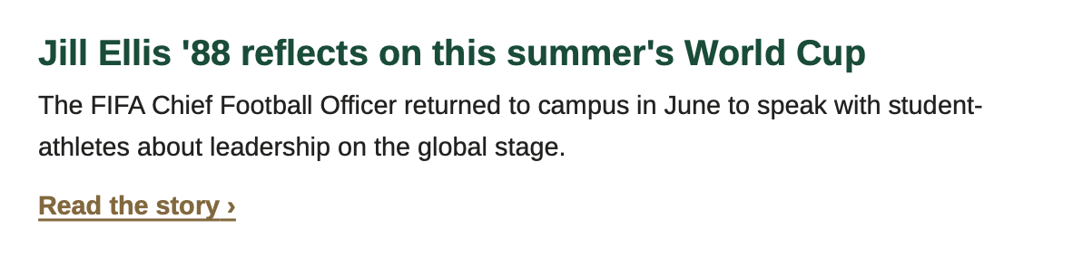
Figure 5: Example of an article heading with a paired CTA.
Navigation Links - W&M Green

Figure 6: Example of navigation links using all capitalized letters and W&M Green (#004E38) text without an underline.
Footer Utility Links - Dark Silver

Figure 7: Example of footer utility links using Dark Silver (#565858) text with an underline.
Inline Body Link on Dark Green Background - Web Gold

Figure 8: Example of an inline body link using Web Gold (#B08F5A) font with an underline surrounded by White (#FFFFFF) body text on a Dark Green (#183028) background.
CTA Text Link on Dark Green Background - Web Gold

Figure 9: Example of a CTA text link using Web Gold (#B08F5A) font with an underline and a chevron on a Dark Green (#183028) background.
Approved Colors and Use Cases
From an accessibility standpoint, it is critical that we pair the correct brand colors to one another.
- Dark Gold is the approved link color on White, Lightest Silver, and Lightest Gold backgrounds
- Web Gold is the approved link color on Dark Green backgrounds only. It fails contrast on light backgrounds and W&M Green backgrounds.
- W&M Green is not approved as a background for inline text links. It may still be used as a section background when the only content is a gold button.
| Token | Hex | Use Cases |
|---|---|---|
| White | #FFFFFF | Text on Dark Green backgrounds. Also a section background. |
| Dark Gold | #846838 | Link text on White and Lightest Silver backgrounds. CTA text links, inline links, secondary buttons. |
| Web Gold | #B08F5A | Link text on Dark Green backgrounds. Never use on White and Lightest Silver backgrounds. |
| Soft Black | #212220 | Body copy on White and Lightest Silver backgrounds |
Writing Link Text
- Describe the destination. "Read the 2026 housing policy" tells the reader where they are going. "Click here" and "Learn more" do not.
- Front-load the meaningful words. Screen reader users often navigate by pulling up a list of every link in the message, with no surrounding sentence for context.
- Do not use the raw URL as the link text unless the reader genuinely needs to see or transcribe the address.
- Do not use the same link text for two different destinations in the same email.