


One Tribe, one family — and now, one visual identity
 University logo The new university logo will be the primary identifying mark of the university. It contains the cypher, a word mark and the College's year of charter. Image courtesy of creative services
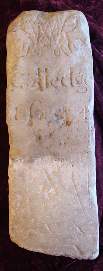
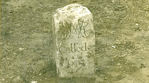 A long history An early version of the cypher may be seen on this W&M boundary stone, created in 1694. The boundary stone is now in the Special Collections Research Center at Swem Library. Photo courtesy of the Special Collections Research Center
After several years of research, design work and community feedback, William & Mary has unveiled new visual identity guidelines meant to bring consistency to the use of logos and graphics across the university.
The guidelines include a new logo, designed at William & Mary, that will be the primary identifying mark of the university. The logo contains the cypher, a word mark and the College’s year of charter.
“The new primary logo will look familiar to the William & Mary family,” said Tina Coleman, director of creative services and chair of the visual identity committee. “It’s a beautiful design that incorporates the history and elegance of the university, but we’re not introducing anything new. It’s a refinement of what we’ve been using so that we can bring more consistency to how we visually represent William & Mary.”
The guidelines are available in an online style guide that contains information on usage of the new design, sub-brands, alternative marks and official school colors. Anyone may view the guide, and people with W&M usernames and passwords can log in to download image files as well as templates for such things as presentation slides, business cards and letterhead.
A rallying point
The work of the visual identity committee began four years ago when President Taylor Reveley charged it with formalizing a primary logo for the university and also establishing guidelines for use of all visual marks associated with William & Mary. Previously, there was no formal guidance on visual identity, and there were many logos and disparate marks being used across campus.
 “When you have a bunch of different marks, there is no central identifying mark, and you don’t provide the people who are excited about William & Mary some kind of visual to rally behind,” said Justin Schoonmaker, associate director of design for creative services. “The current guide is something people on campus have been asking for. It’s been wonderful to see the positive reaction as we have been sharing the work of the committee and the purpose of the guide with our colleagues.”
The committee members researched the marks used by more than two dozen universities and conducted several focus groups with faculty, staff, students and alumni. From that work, the committee found that people in the William & Mary community had a greater emotional connection to two historical marks – the cypher and the seal – than any “W&M” graphics. Both of the historical marks trace their roots back to the 1690s, with the cypher appearing on a campus boundary stone and the seal containing the College’s royal coat of arms.
Although initial feedback from W&M community members showed a preference for the cypher, the committee wanted to test both historical marks. Its design subcommittee, led by Schoonmaker, created four possible presentations of the cypher and two of the seal. The six designs were included in a brand survey sent to more than 80,000 faculty, staff, students and alumni by university advancement in January 2014. The results were clear: 70 percent of respondents preferred the cypher over the seal as the university’s primary logo. With the direction for the university logo decided, Schoonmaker met with top administrators from the graduate and professional schools to talk about creating sub-brand designs based on their specific needs.
“We wanted to provide the schools some flexibility in sub-brand design so that they could maintain their own identity while making it clear they are within the same William & Mary logo family,” said Schoonmaker. “So a couple of them look slightly different from the rest, but, taken together as a whole, they provide the university with a much more consistent visual identity.”
A guide to the guide
The style guide contains six sections, the first of which focuses on the new university logo – how to use it, how not to use it, what colors may be used for different applications and what variations are accepted.
The second section provides details on the university’s four official colors: William & Mary Green, William & Mary Gold, Spirit Gold and William & Mary Silver. Spirit Gold is a brighter color that is intended for use by athletics or in more casual applications. Silver, a lesser-known W&M color, is intended to be used as an accent color. Each color’s Pantone, RGB, CMYK and hexadecimal numbers are provided in the guide so that the exact hue may be selected for use in various applications, from clothing and merchandise to computer displays and print publications.
The next section of the guide provides information on additional branding marks that may be used, including the seal, “W&M,” the Tribe script and the Griffin. Although none of those marks are going away, the guide provides information on how each should be used. For instance, the seal will now be used primarily for ceremonial occasions on items such as diplomas or academic regalia. The Tribe script and Griffin will continue to be used by athletics without alteration.
“It’s important to understand that the historic seal, Tribe and the Griffin marks are not going away,” Schoonmaker said. “The style guide reserves the seal for more formal uses. The Tribe and Griffin marks are very popular with our athletics teams and will continue to be used as they are today. The committee is not recommending any changes to the use of those marks.”
The use of decorative graphics -- including the 1693 weathervane, Crim Dell bridge and stand-alone cypher -- is detailed in the fourth section of the guide. For instance, the weathervane may be used as a watermark or clothing graphic.
Graduate schools, student organizations, and departments, offices and programs are included in the following section on sub-brands. Departments, offices and programs are discouraged from developing their own logos and are, instead, asked to either develop a text-based treatment for their names or develop a “signature lockup” – a variation of the new university logo that includes the name of the office under the William & Mary word mark.
Recognized student organizations may continue to use their logos and will have the same rights to marks as any office or program, said Coleman. The final section of the guide contains the downloadable university templates for university communicators.
Implementation
Creating a unified visual identity is important for several reasons, Coleman and Schoonmaker said, including gaining recognition for William & Mary outside of the Mid-Atlantic region.
Becoming globally recognized is difficult for any brand, especially without millions of dollars to pump into TV ads and billboards, said Schoonmaker.
“It’s all-the-more difficult when there is no central, unifying mark because the mark you introduce to, say, one segment of the population in Oklahoma may not be introduced to a population in Florida,” he said. “But when you have one unifying mark, you’re able to tie in all of those advertising efforts. Your audiences everywhere are introduced to the same William & Mary.”
Creating a unified visual identity also helps people who receive communications about the university determine what is officially from William & Mary and what is not, he added. Likewise, it helps shoppers identify official university merchandise.
“A prospective student who is looking at William & Mary and loves the idea of coming here doesn’t know what the official, legitimate William & Mary merchandise is,” said Schoonmaker. “But when you have a primary logo, your recognizability creates new potential for people to be excited about your visuals and can bring in new revenue streams because people can identify the true William & Mary products.
“You don’t want the Nike knockoff; you want the true Nike product.”
A licensed merchandise working group -- led by Andrea Sardone, chief marketing officer for the Raymond A. Mason School of Business, and including representation from athletics, auxiliary services, creative services, and university advancement -- is looking into how the university can capitalize on that desire by making W&M-branded merchandise easier to buy both on campus and during signature events such as Charter Day. The group, which was spurred by the university’s business innovation effort, is also seeking ways to keep merchandise consistent with the university's visual identity.
"Our working group very quickly identified the unmet need and demand for branded merchandise, and the visual identity work has definitely opened the door to the possibilities and opportunities,” said Sardone. “We have both short-term and long-term goals to get William & Mary branded merchandise into the market for alumni, prospective students and friends of the university."
Various offices on campus have already started to implement use of the new logo in their communications, and the W&M community will soon see it across campus as signage gets replaced and new merchandise is introduced to the bookstore.
Coleman and Schoonmaker have been presenting the style guide to departments and groups across campus. Response has been overwhelmingly positive, they said.
“The first reaction has been people asking how soon can they start using these marks,” Schoonmaker said. “Many of the schools have already adapted their communication materials and websites to reflect the new design. My email inbox is full of requests from others on campus who want assistance or guidance on a planned communication piece such as a brochure or banner. That kind of enthusiasm and momentum is what we want, so it has been great to see.”